Packaging: Sweetwaters Coffee & Tea
Loose Leaf Teas
The Sweetwaters Coffee & Tea brand is well established in southeastern Michigan. Established in 1993 in Ann Arbor, Michigan everything they produce is steeped in the founders Chinese heritage. With their turn towards out-of-state franchising they needed to update their packaging for greater brand visibility, and clarity of product as their teas would be seen by fresh eyes.
Problem
Problem one with the loose leaf tea packaging is misplaced text, leading to lack of product clarity. The old packaging told a story about the tea in general, but gave no specifics about if the tea was black, green, oolong, or herbal. Additionally the “premium” versus “select” tea labels are not helpful on the front of the packaging. While a barista in the cafes could easily explain the tiers of quality of teas offered, this information is not useful in a decision to buy.
Problem two was a poor utilization of space. Below the paragraph of text there was a large white space on a finite and precious area in which to catch the customers’ eyes. The aforementioned “premium” text also serves as poor space utilization due to repetition in the vertical text, the paragraph of text, and the yellow highlighted text below the black banner area.
Solution
To solve the copy issue I moved the paragraph of text to the back of the package. It is still useful, as the sentiment of the paragraph still connects the customer to the heart of a lovingly crafted product. But it’s now a reward for those intrigued enough to pick up the product and turn the package around to read further. And there were more people engaging with the product because there were useful flavor descriptions.
I removed the additional “premium” yellow label, and changed the vertical text to methods of preparing the tea to inspire customers.
Once that paragraph was moved it freed up space to allow for bolder branding. I did not want to change the design entirely, due to the existing loyal customer base. However, any new eyes needed to associate the large red stamp-like mark of the logo with quality. By swapping the locations of the logo text and logo mark I was not limited by the lid size, allowing for a larger, bolder impression. I subtly increased the color contrast of the Chinese characters in the background as well.


Bottled Teas
Problem
The issues with the bottled tea packaging were very similar to the loose leaf tea. Poor brand visibilty, and a difficulty for the customer to know what they’re buying.
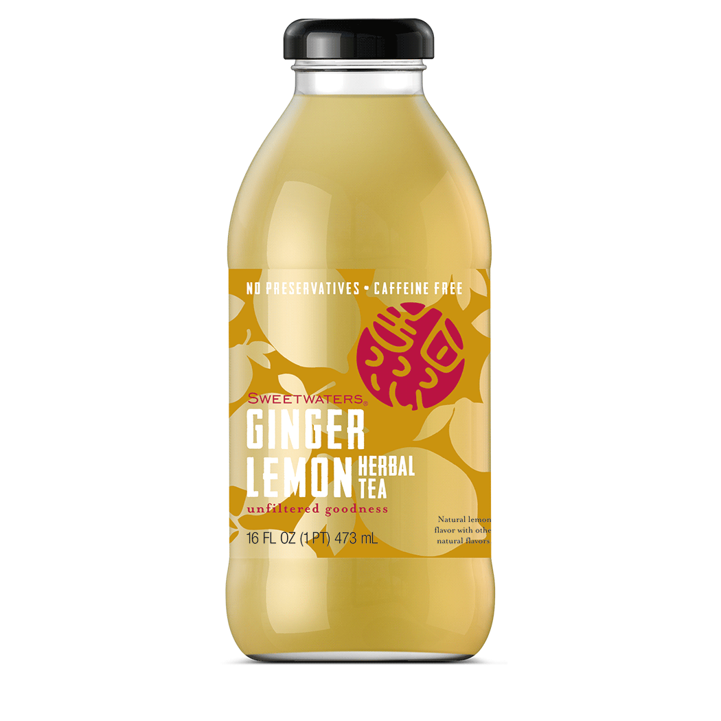
The ginger lemon drink is a Sweetwaters staple, and released a few years prior to the ginger raspberry. When it was first bottled the red logo mark was only ever pictured against a yellow liquid. Once the ginger raspberry was released the logo mark disappeared. Additionally on both the thinness of the word “ginger” and also “tea” is difficult to read (even for those with 20/20 vision).
Secondly, there was a gap in customer knowledge. By using the word tea without the modifier of “herbal” many expected it to have caffeine. The label needed to plainly spell out that this was an herbal tea, and it was caffeine free.
Solution
The first step was increasing brand visibility. As in the loose leaf tea packaging I increased the logo mark size. This tea would now be seen by potential customers all over the country, and they need to know our brand at a glance. While we kept the brand color on the logo mark for the ginger lemon, I changed it to white for the ginger raspberry, because brand colors become irrelevant if you can’t see the logo at all.
While keeping ginger raspberry or ginger lemon as the largest text (the flavors that make someone pick the drink off the shelf), I ensured that herbal tea was still spelled out plainly, and in the same font on both bottles.
I also made the graphics as bold as the fonts themselves now were. These teas were originally only sold within Sweetwaters cafes, however they were beginning to sell in grocery stores too. When sitting on a shelf next to a competitor, a customer sometimes looks for visual cues to flavor before reading labels. I added fruit silhouettes for texture and as an extra punch up for the customer to know exactly what they’re purchasing.