Branding: De Colores Bakery
Problem

Valeria Salcedo García is a Mexican American baker who approached me about branding for her business, De Colores Bakery. Her bakes are inspired by her own experiences while also honoring her heritage. Both her family’s hometown in Mexico, and where she settled in Ann Arbor, Michigan are along the monarch butterfly path. She hoped that could be incorporated as an an homage.
De Colores means “of colors” in Spanish alluding to the brightness of joyful celebrations. The branding needed to playful, welcoming, and vibrant to complement the De Colores name. However, with the target audience being adult buyers, the brand still needs to render professionally rather than childish.
Solution
Knowing I wanted to use high-saturation colors I began research. Finding regional-specific Mexican textiles I pulled a color palette of options, eventually choosing a balance of warm and cool tones.
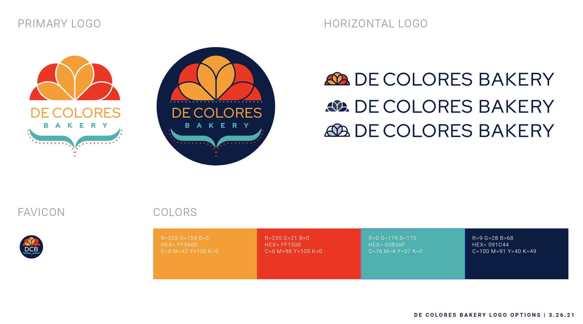
To avoid the bright colors skewing too juvenile I opted for pure geometry as much as possible, both in the illustration and in font choice. The illustration uses only semicircles and straight lines. This is functional as well for building out brand and illustration guidelines as the brand grows.
The flower illustration originates in Mexico’s uses of marigolds for celebration, most notably during Día de los Muertos. Marigolds became the obvious representation for the brand given bakery items are usually purchased surrounding celebrations, and cakes are often decorated with flowers. Although butterflies were not the chosen symbol for the brand, I snuck a butterfly silhouette into the flower to honor Val as the business owner.


Logo alternates
Most potential customers would interact with the brand online. Val and I discussed whether she would open a brick and mortar bakery, and it wasn’t impossible, but she would begin with online orders until business became steady enough to sustain a storefront. This takes many print limitations off of the interpretation of brand colors. However, I ensured the logo would render in one-color for any printed business documentation so that ink would not be wasted printing invoices in full color. This is a small but important cost to consider for any small business.
Additionally, I utilized more of the researched Mexican textile colors to create a pride logo. It was important to Val that her brand be inclusive to any individual or family wanting to order her baked goods.


Promotional Materials
The main opportunity for brand promotion is after customers receive a baked good. We created business cards to leave with baked goods after cake pickup. One focused on De Colores being a local small business. I used the marigold/butterfly system to create a map pindrop icon within the marigold. The other card focused on De Colores being a woman-owned business, featuring an image of Valeria.


We created multiple social profile headers. One very simple option, one slightly decorative version, and one version that abandons the logo to focus only on illustration. Optimally this would be seen as customers write reviews and recommend De Colores to friends and family online.


The last promotional item was a set of stickers and buttons. Stickers could be used upon cake boxes, upon paper bags for any pickup orders, or given away to any happy customers. I provided an eye catching die-cut sticker, and a budget friendly classic circle sticker. Buttons were not as feasible to order until the customer base grew-larger, but the artwork rendered beautifully in small scale.

