Branding: Cisco Secure
Problem
During 2020 the world shifted to remote work. Suddenly security shifted into the spotlight as top priority for companies looking to safeguard employees working from home. Cisco was poised to fill that role as a provider of security solutions, but had a multi-faceted security brand issue to resolve first. Our in-house design team worked together to pitch a new name, new sub brand, and a new design system to Cisco’s security executives. Below you will see selected slides from our Cisco Secure brand pitch. The Cisco Secure brand launched in 2020 and shifted towards a new Cisco Security style in 2023, now standing as a brand concept.
Perception of Networking vs Security
Our first step was to research. After performing some competitor analysis and customer interviews it became clear that the general populace considered Cisco primarily a hardware and networking company.

Regardless of our broad security offerings, we were not speaking to or reaching a security audience. Networking folk want to keep the lights on. How can I make this setup work? Security folk want to find the footholds. How can this system break? How can it be safeguarded against breaking? Even though we had solutions at Cisco, we were messaging our security offerings as if we were speaking to a networking buyer.

Visual Chaos from Acquisitions
In this instance we were stepping on our own tail. Cisco’s strength in security is also part of the reason people didn’t think of us as a security brand. The breadth of offerings was due to Cisco’s growth through acquisitions, leading to the best technology, but lingering scraps of former brands and rebrands. Even attempts to streamline these brand scraps into a cohesive quilt by adding the Cisco name at the front of the product could not visually tie them together, as demonstrated in the following image.

Confusion and Stereotypes Within Security Visuals
The next facet is not exclusive to Cisco. The security industry at large has difficult finding simple images to represent complex topics. How can you represent something as abstract as a security framework or a specific attack vector with just one image? And after factoring in subtleties within the security audience how can imagery give details to a technical buyer but remain digestible enough for an end user?
As a result, many in the industry rely on over simplified, inauthentic stock photography that’s at odds with a skeptical security buyer. Alternatively, in an effort to play into the skeptical buyer some imagery shows edgy hackers, glowing text, and equally inauthentic “hacker” types in black hoodies. Camp and fear leave just as equally bad of tastes in our audience’s mouth, and makes it difficult to establish a unique visual identity within the landscape of security brands.


Solution
Name + Logo
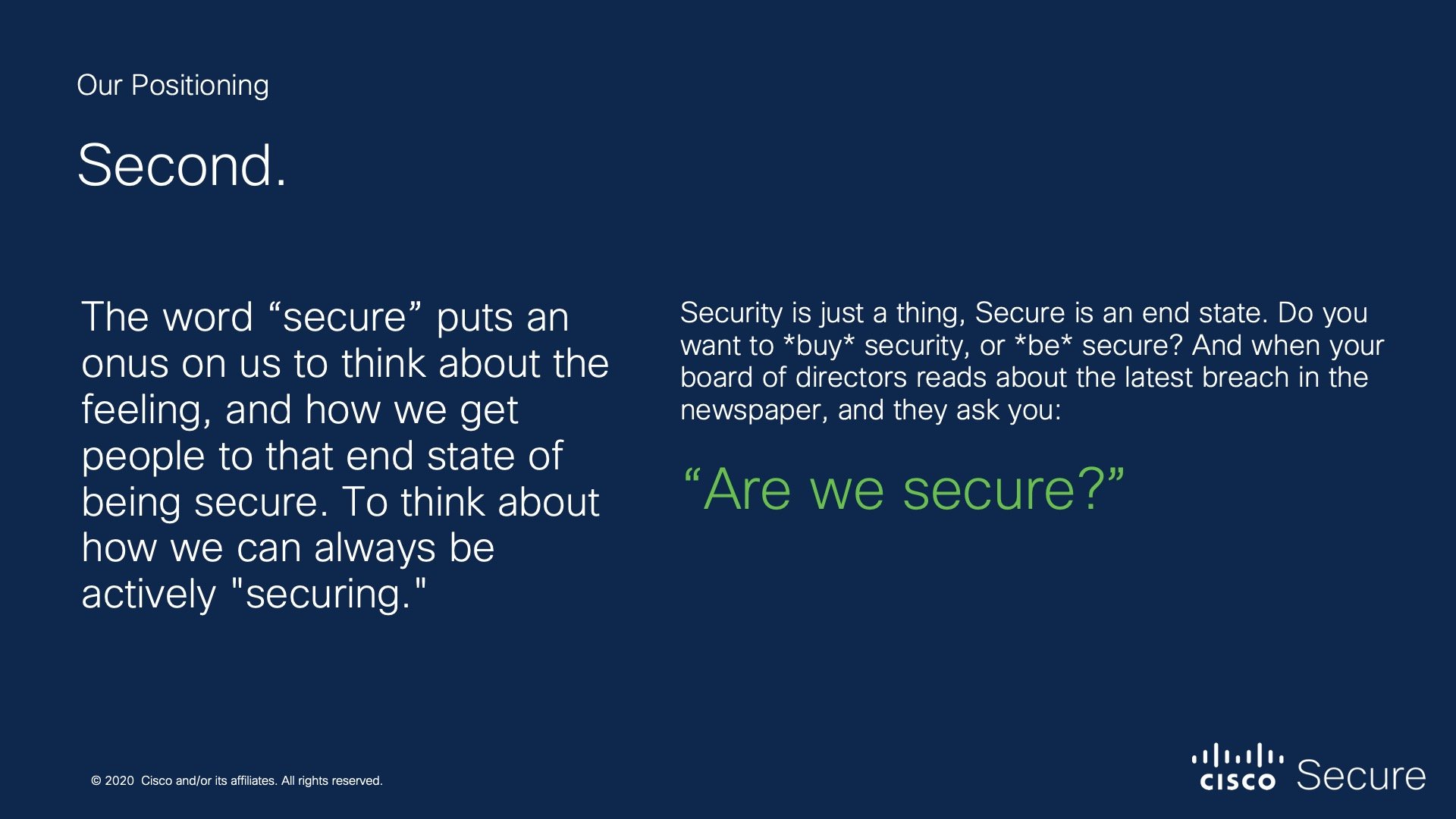
The first goal was simplification, starting from the top with our brand name, leading down to product naming. This would make one brand, with one unified suite of products.
The brand name is Cisco Secure. Our audience, the skeptical security buyer, wants to breathe easily knowing that there won’t be an issue to remediate or any vulnerabilities to deal with. They seek peace of mind. Security is a thing, a product, an end goal. But “secure” is a feeling, a state of being, and the true goal of our audience. That’s what it means to be Cisco Secure.

These product names were proposed, but not all names were adapted. Not only are the products clearly related within one suite of available Cisco products, but they’re more descriptive to the audience than the prior names. The naming architecture also allows for future expansion as Cisco continues acquiring and building new technology.

Collage + Design System
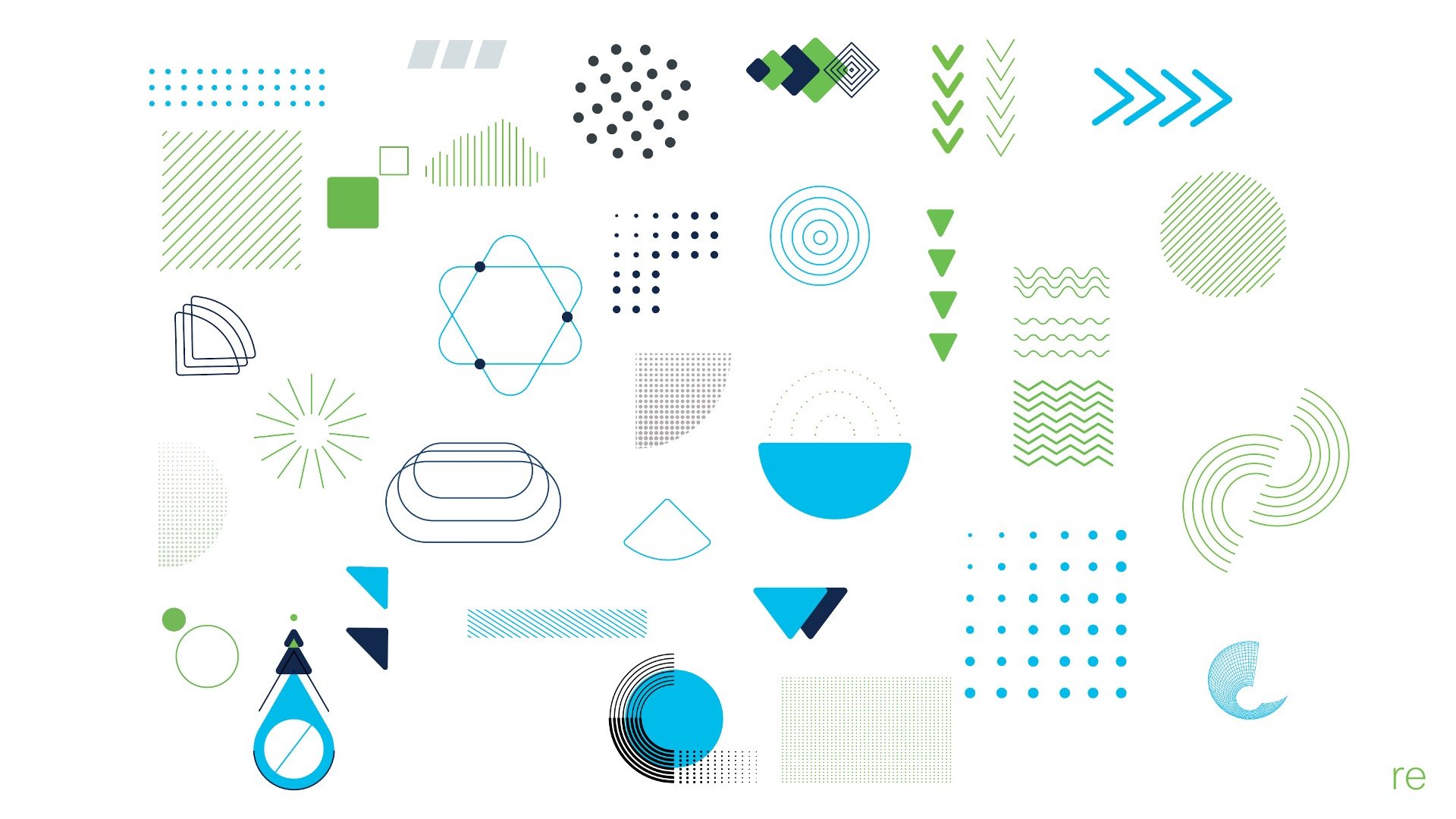
To combat the difficulty of representing complex security concepts with single images, we removed the limitations of “one image.” Collages can be built to tell stories that one stock image could not tell. But, to retain the convenience of stock imagery we built our collages by cutting out pieces of stock imagery, and toned them black and white so the pieces would combine with cohesion. Our designers created an image bank of cutouts and shapes for subject matter experts to start building their own visuals.
The collage system is one component of our larger design system. As Cisco Secure was a subbrand of Cisco, we kept the existing brand colors, font, etc. and rearrange them to make green a primary color for Cisco Secure. Green often holds connotation of enabling rather than disabling, and supported our philosophy behind the peace of mind of the Cisco Secure brand name. By reimagining pieces of the flagship Cisco brand we also ensured our subbrand would play nicely with any non-security offerings when presented together.


Marketing Content
The flexibility of the collage system worked in digital assets and print assets alike. This is a proposed e-book whitepaper design. Zero trust is notoriously difficult to represent as a concept, and it’s easy to interpret the story the collage tells.

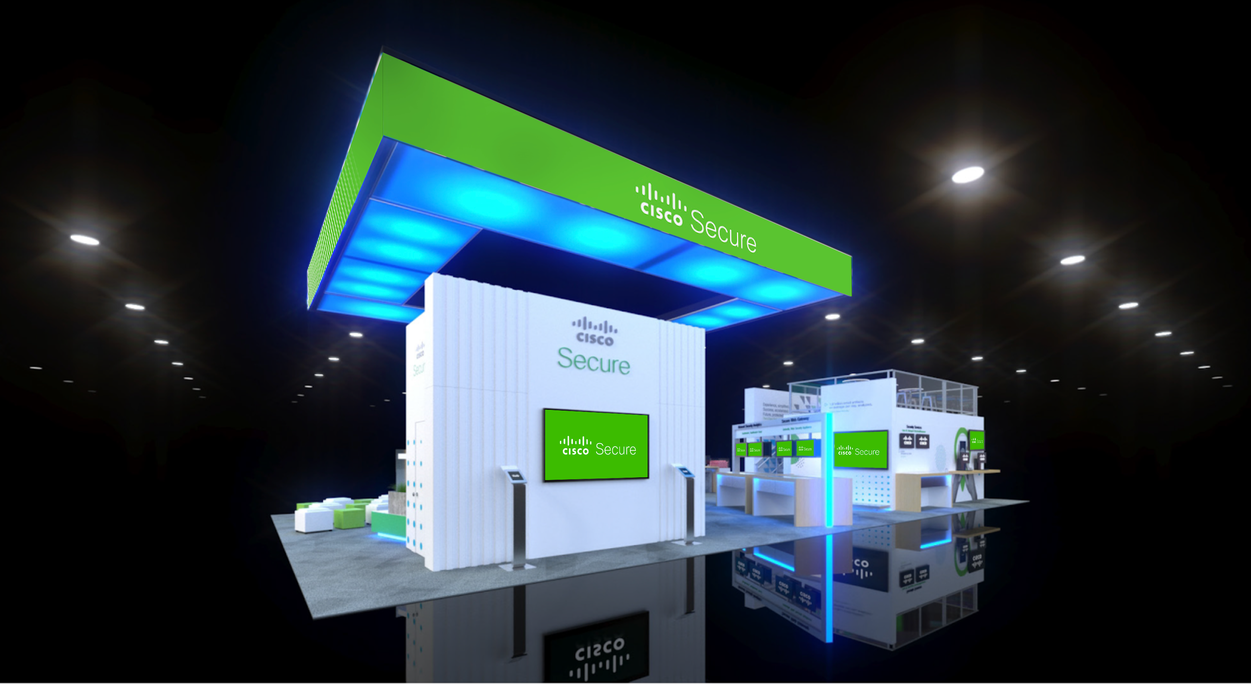
RSA 2020
The Cisco Secure brand launched with Cisco’s booth at RSA Conference in 2020. Duo Security had their own booth that year as well, and was positioned nearby the Cisco Secure booth.
Booth Design
Keeping with the need for simplicity, we stripped back the booth so as many solid colors as possible, with prominently featured green headers. Imagery was only utilized where it supported a concept, and not just to fill space on the booth. In the chaos of so many bodies filling the event space we provided a visual break for tired eyes.


The Duo booth followed a similar pattern as the Cisco Secure booth, featuring green prominently, and offering a visual break. However, where Cisco Secure limited imagery to create visual calm, Duo Security (now Cisco Duo) moved their visuals inside their oversized header panels, to only be seen by the viewer once within the booth.
To my knowledge Cisco Secure shirts were worn at or given away at both booths.


Presentation Design
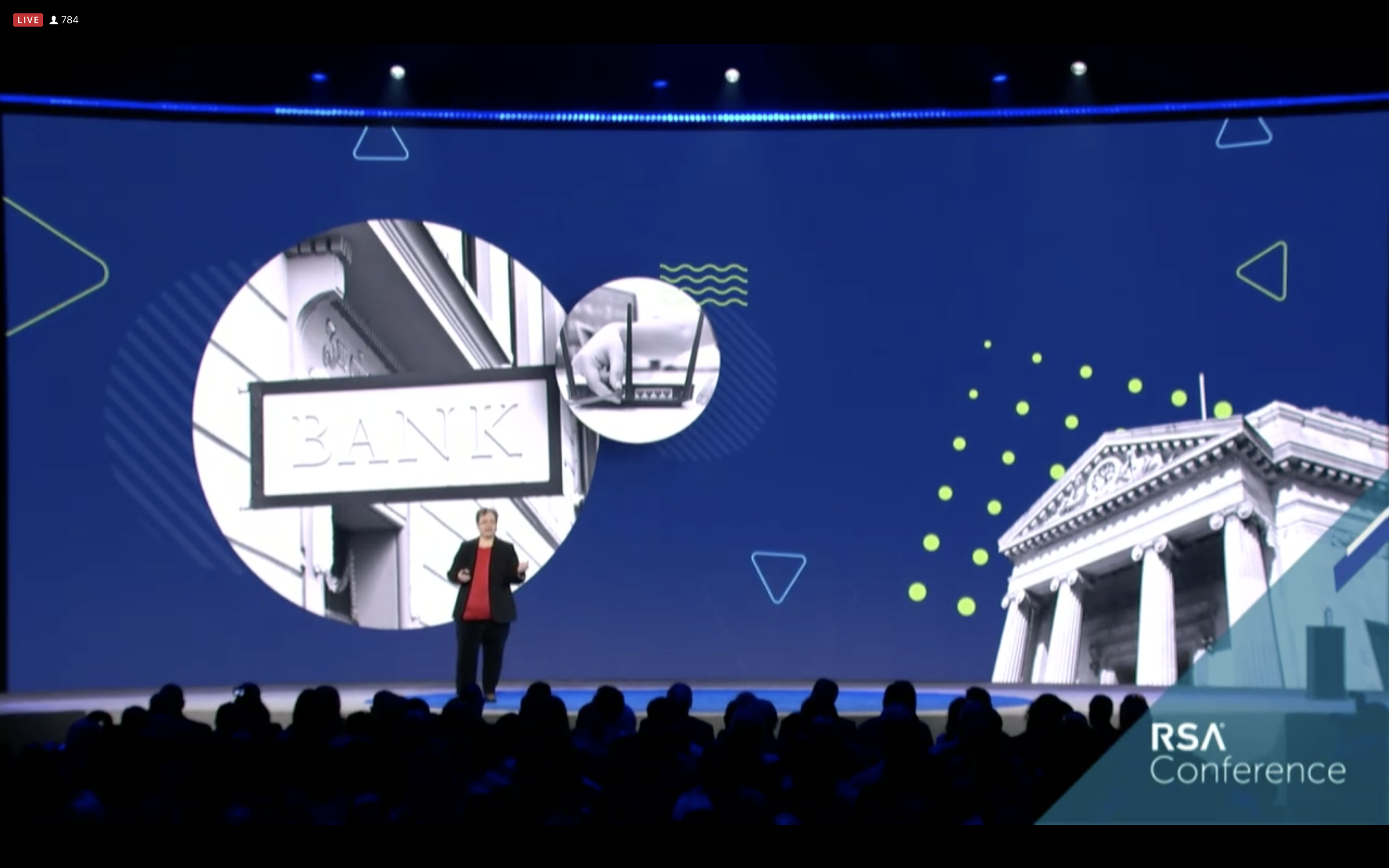
Our own Wendy Nather was a keynote speaker at RSA Conference 2020. We were not allowed to offer specific product or brand endorsements as that would defeat the educational purpose of the keynote. However, the unique styling of the collage system meant we were able to create a subtle brand connection for anyone who had seen our Cisco Secure booth earlier in the conference.
The styling of Wendy’s presentation had a direct influence on the Cisco Secure presentation template created as a resource for employees to use internally and externally.

Out-of-Home Campaign
One unique moment where our audience switched from industry professionals to end users was in our out-of-home campaign prior to RSA Conference 2020. We ensured our collages showed security for real people, not just hackers in hoodies. The copy was easy to understand, and the visuals stayed bright, positive, and highlighted people excited to interact with their technology because they didn’t need to worry about frustrating security measures. They were Cisco Secure.

